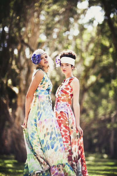
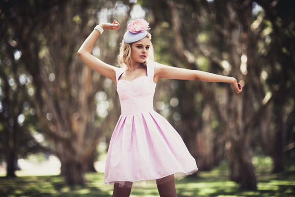
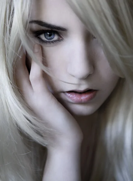
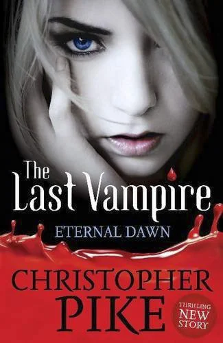
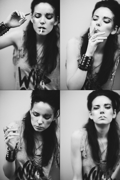
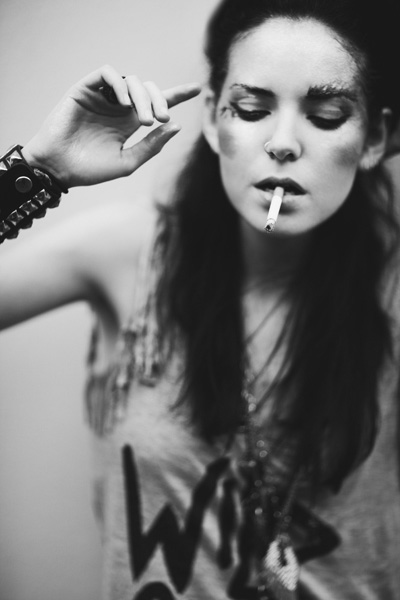
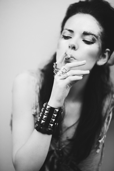
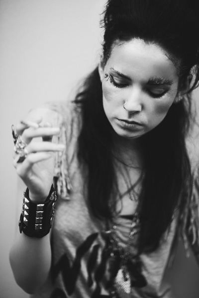
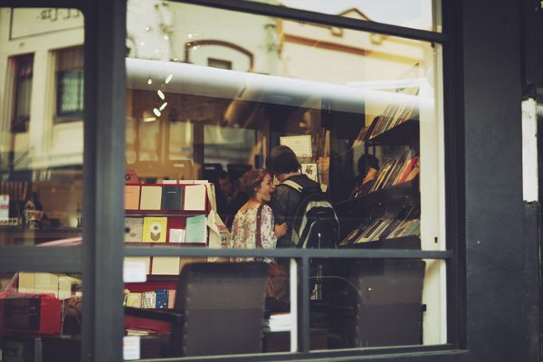
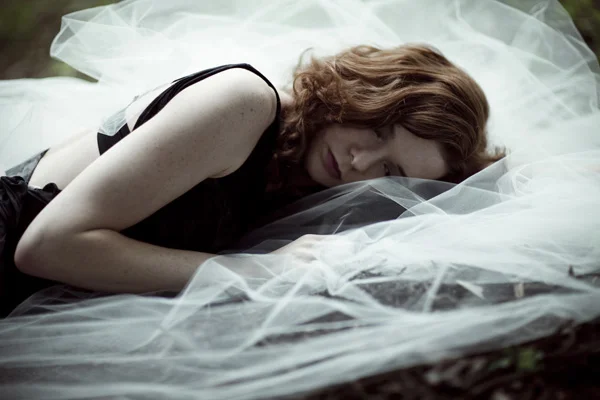
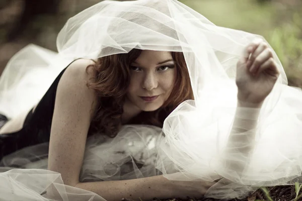
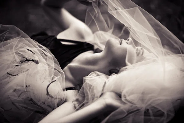
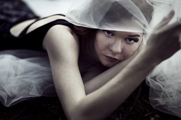
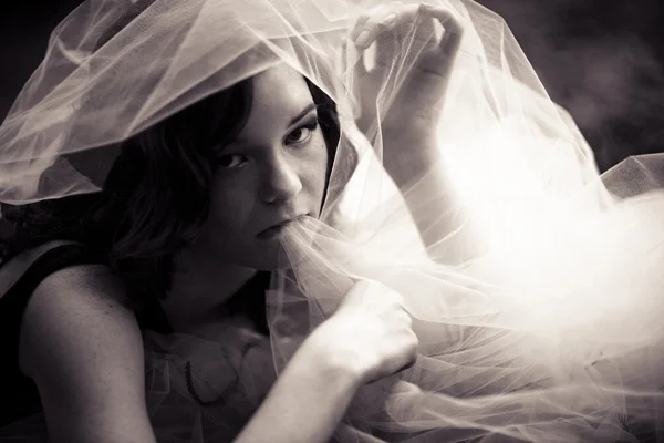
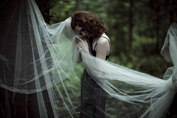
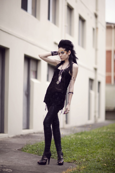
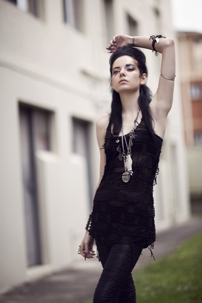
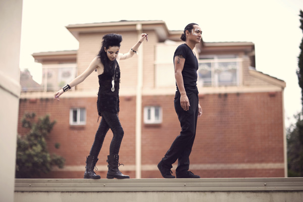
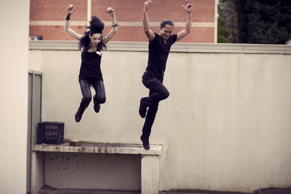
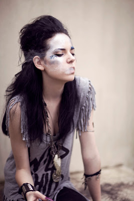
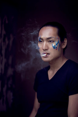
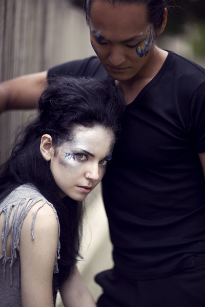
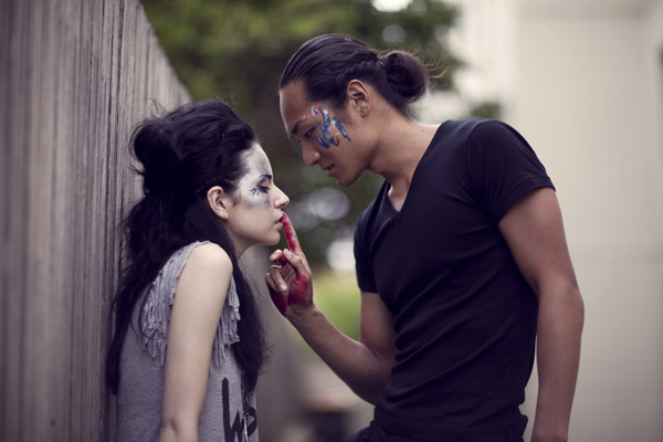
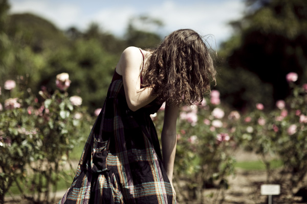
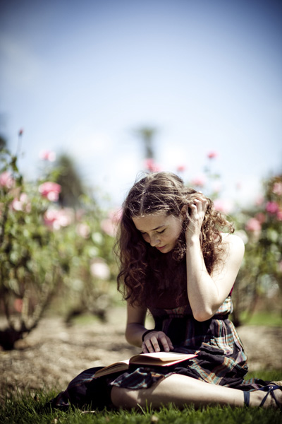
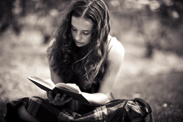
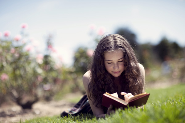
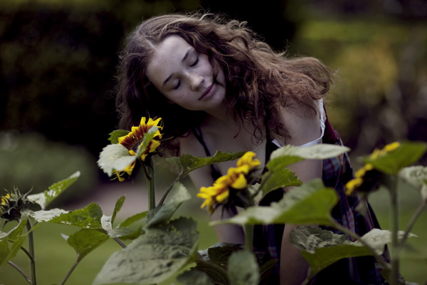
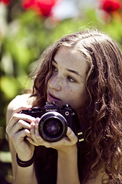
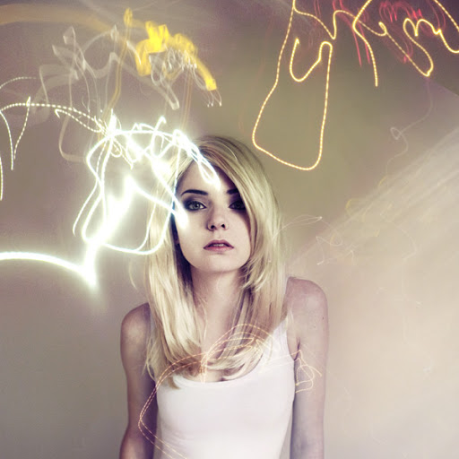
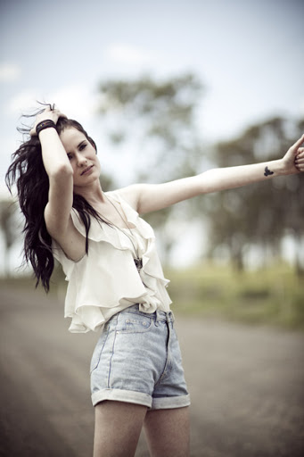
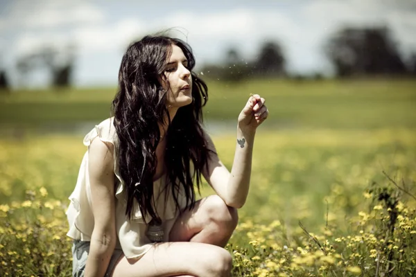
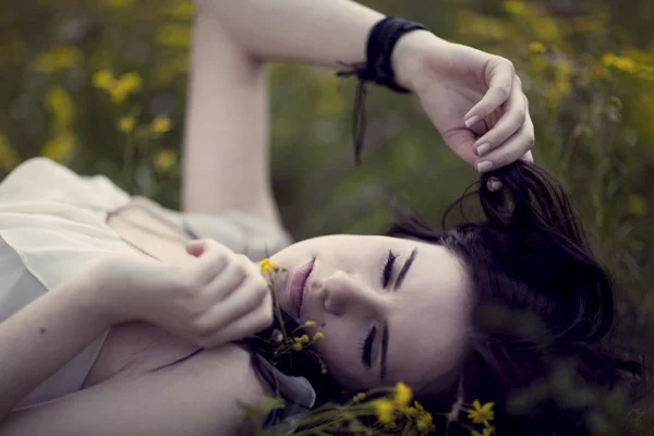
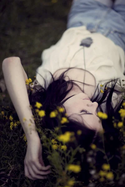
at the beginning of last year i was commissioned to create a series of three book covers for christopher pike and was completely ecstatic about it. i've blogged the photos of the book covers before but if you can't remember just search for "the last vampire by christopher pike" and the lovely connie will come up :)
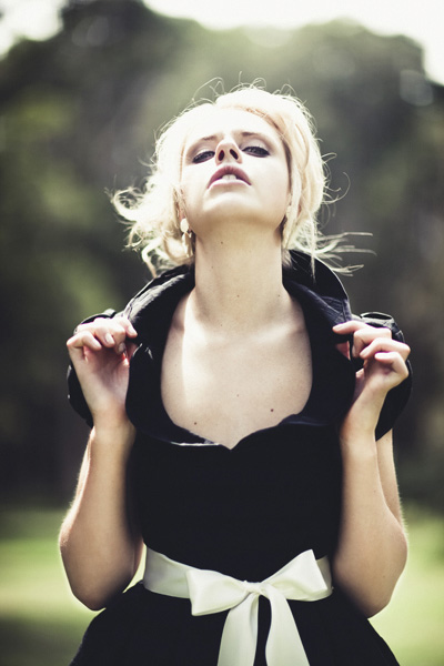
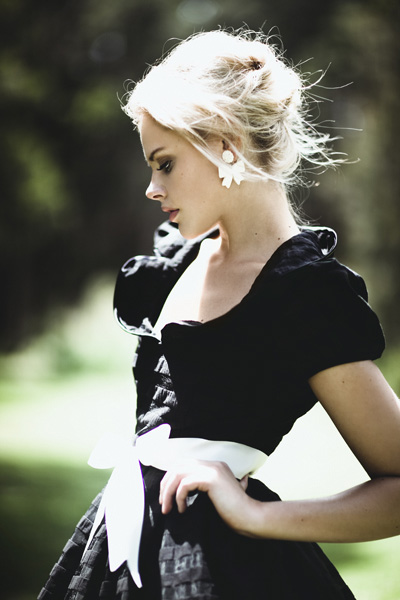
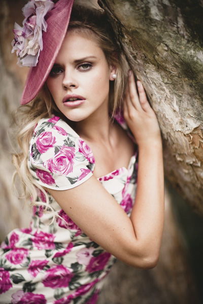
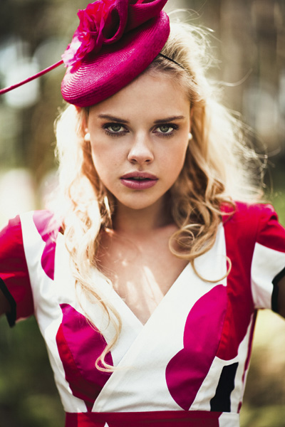
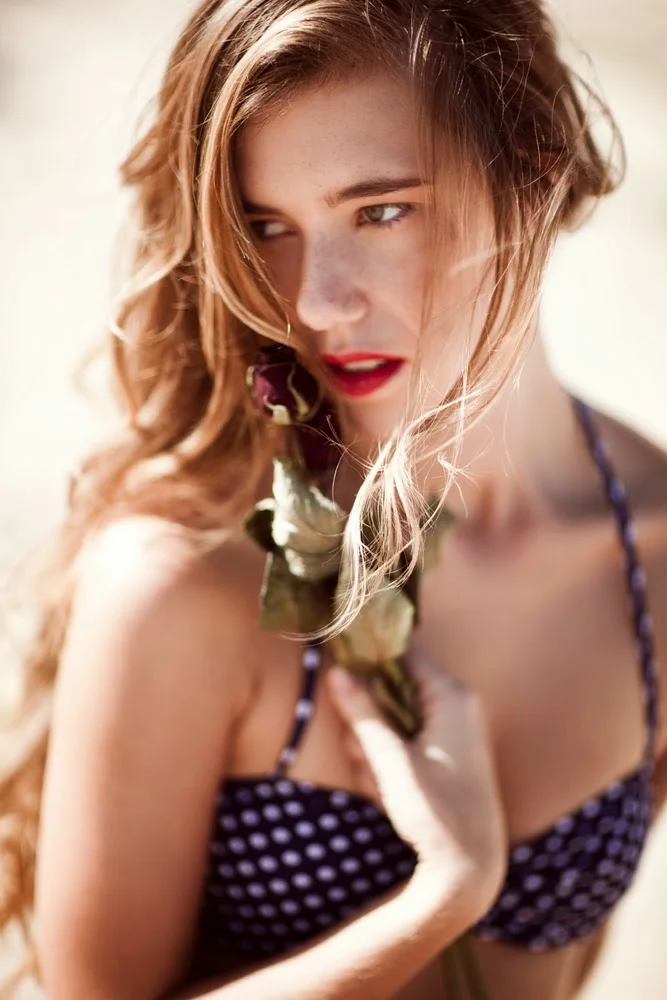
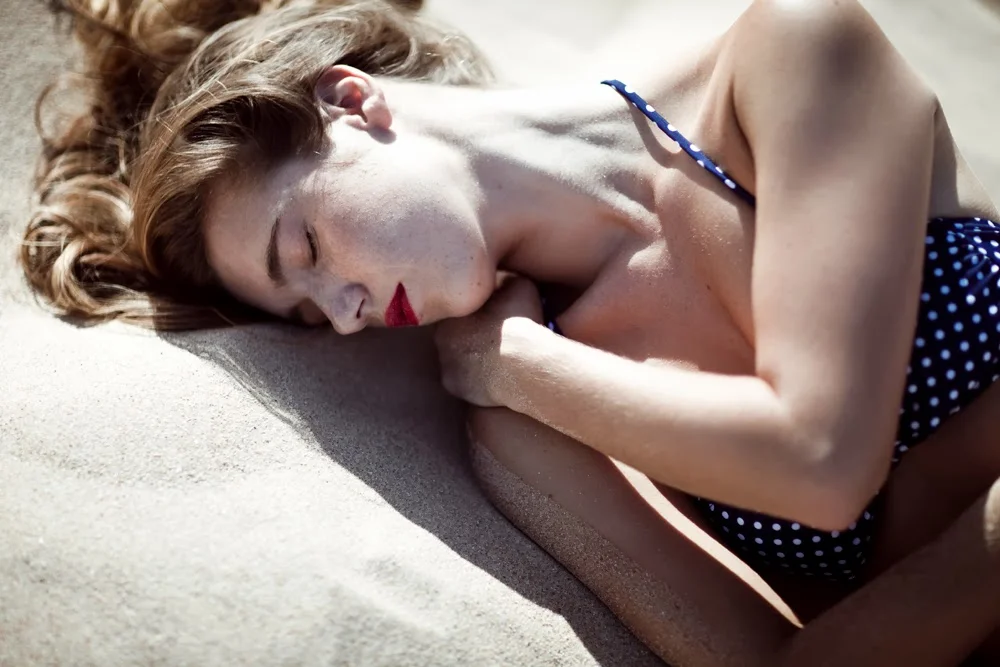
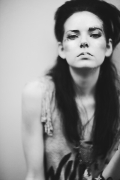
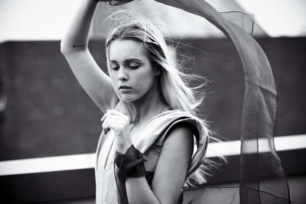
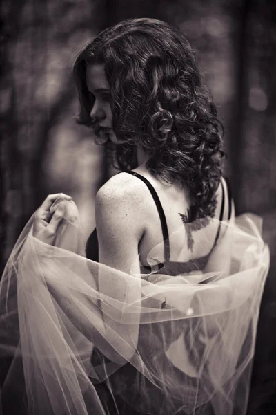
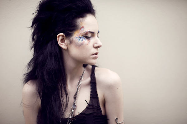
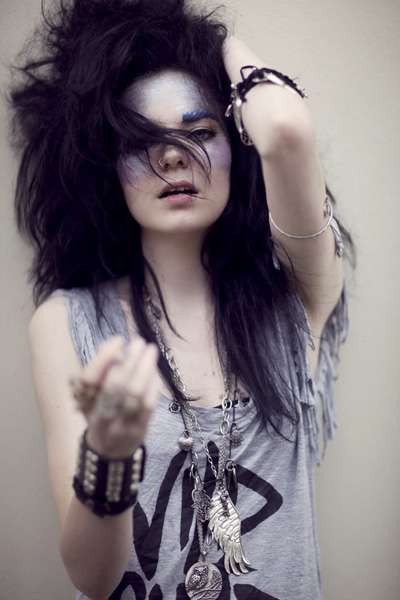
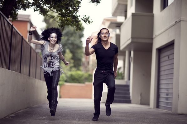
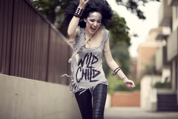
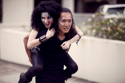
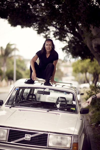
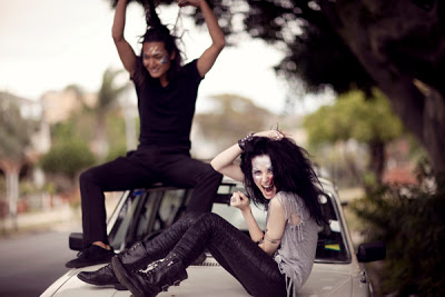
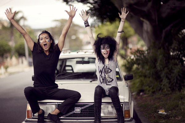
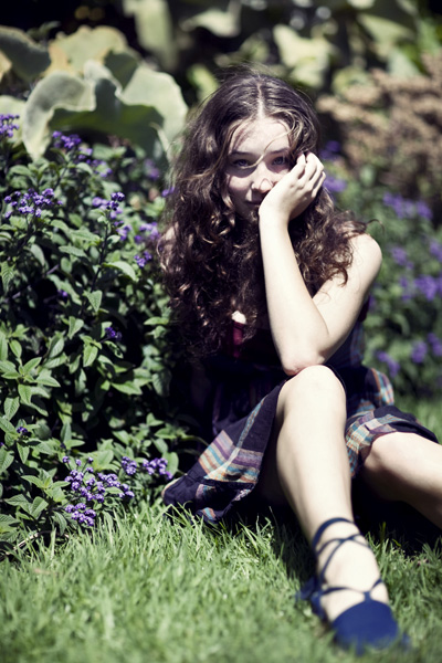
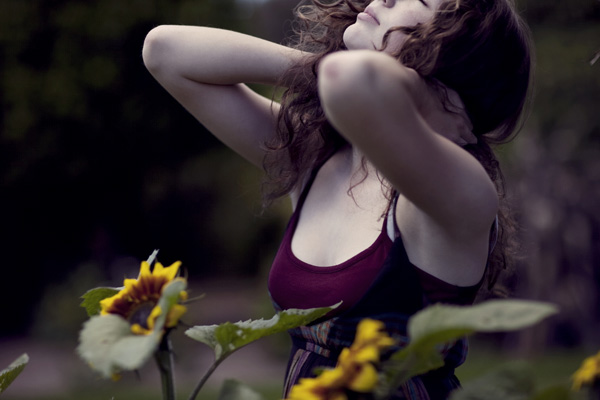
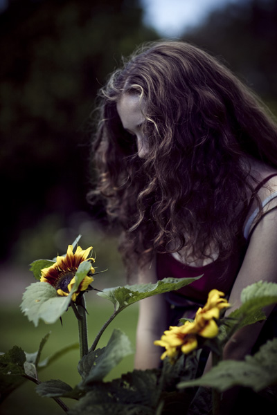
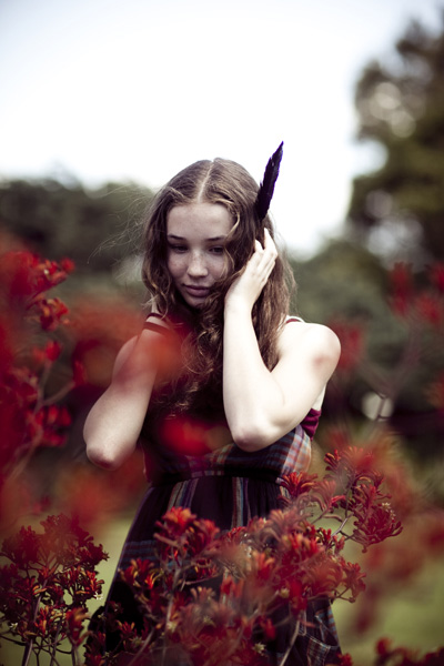
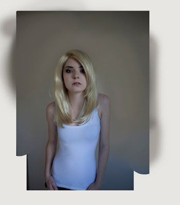
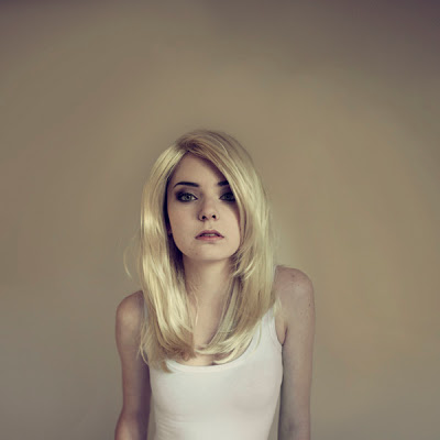
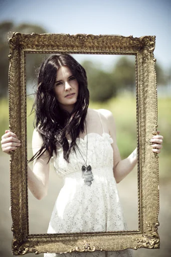
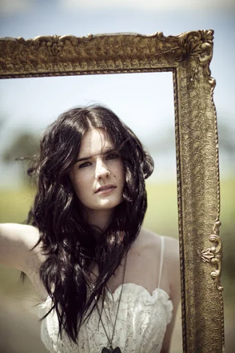
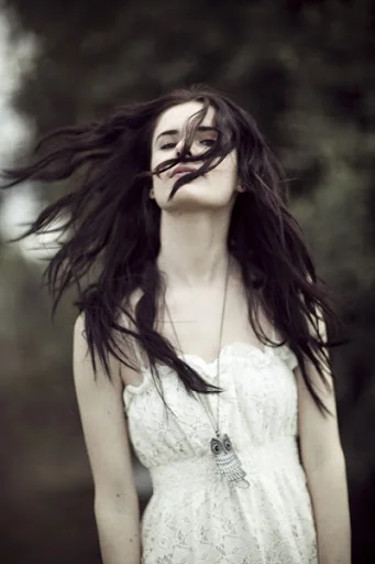
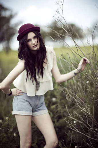
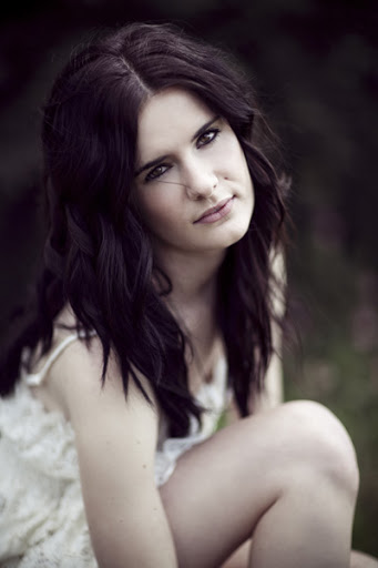
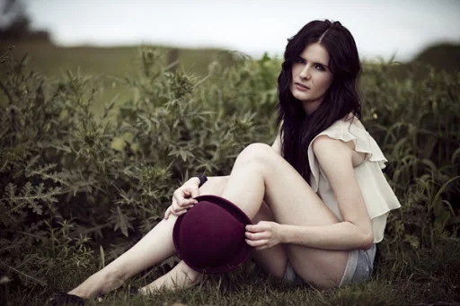
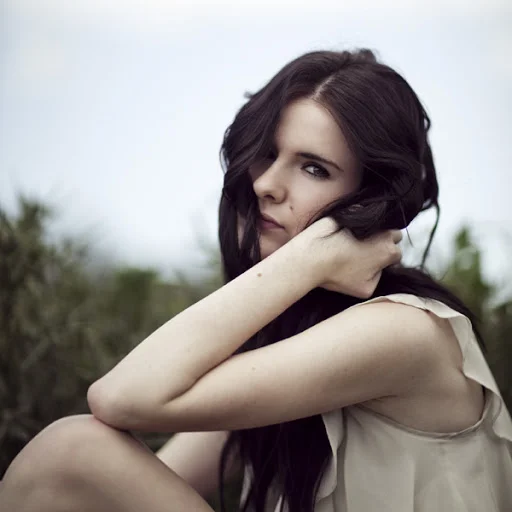
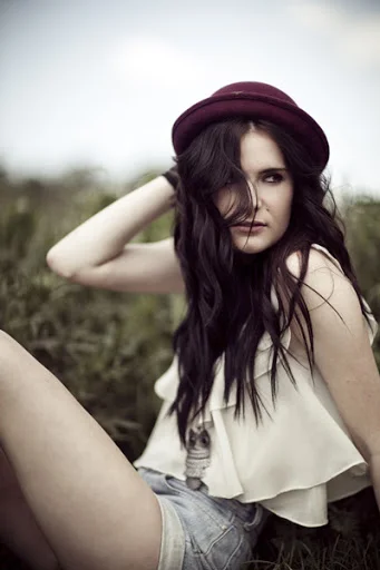
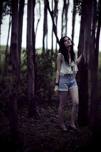
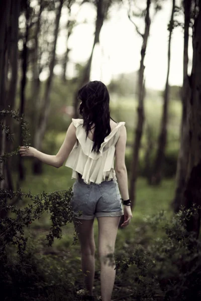
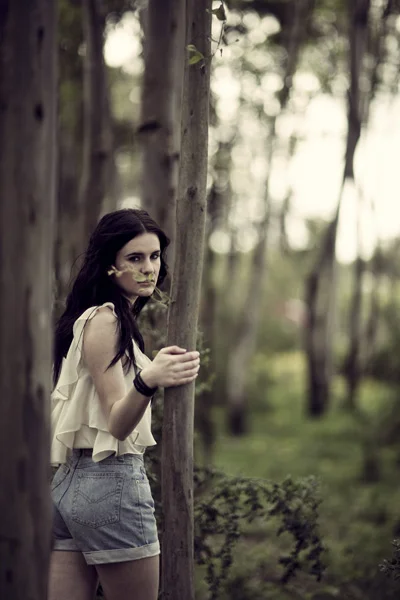
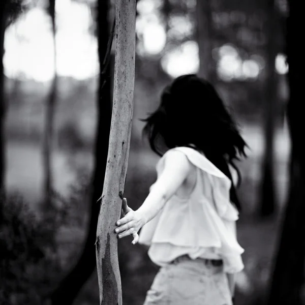
after the three book covers, i was asked to create two more with a different character. i found the amazing lexi who i thought was perfect for it (and she was) and we created the above photo for the latest last vampire book. the picture above is my personally-retouched version, and below is the further edited photo for the actual cover according to their specifications. another book is still to come but i can't say what picture is on the cover yet!
it is really great when someone buys one of my photos from my portfolio to be the cover of a novel, but it is even more amazing and fun for me to be given an outline and to need to create an image or a series of images to be the cover of some really awesome books!
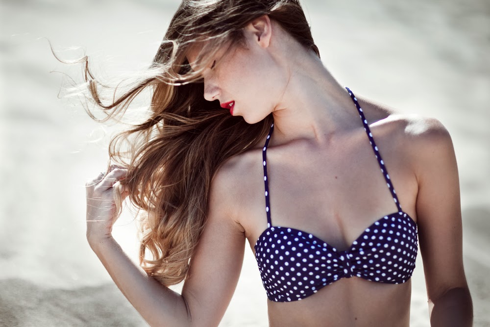
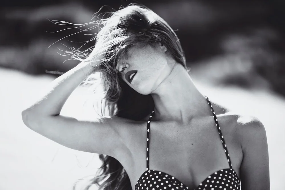
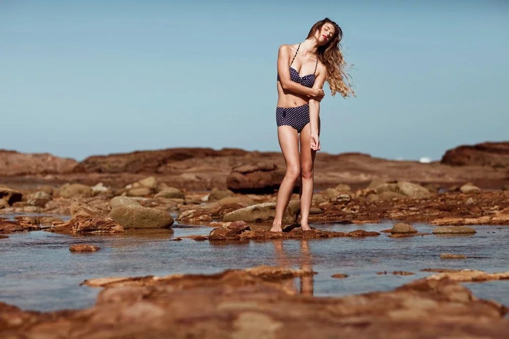
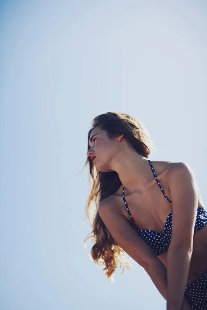
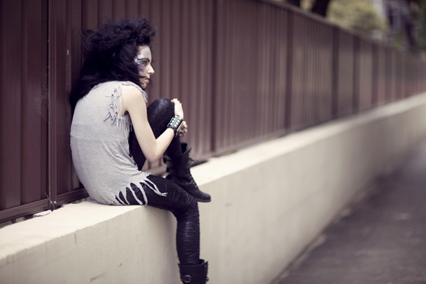
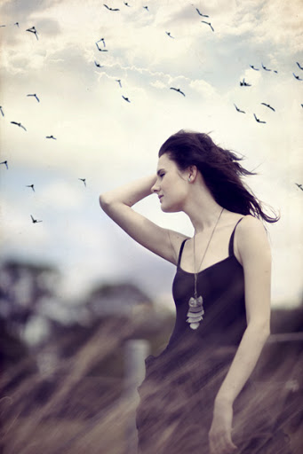
model: the lovely andrea
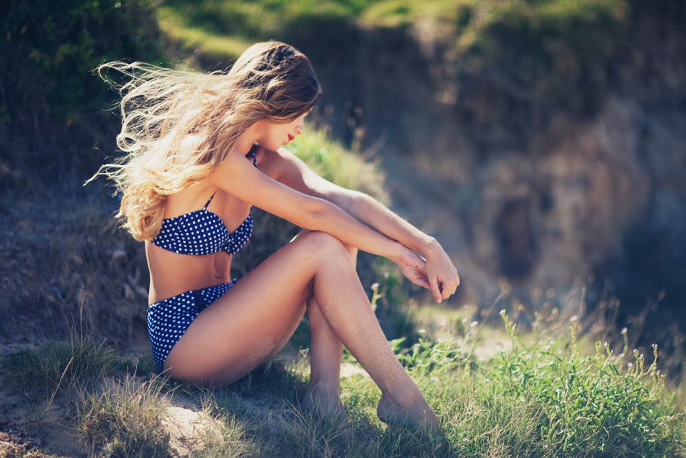
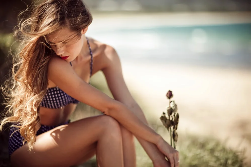
sitting on cliffedge, somedays we're all made of dreams in the sand.
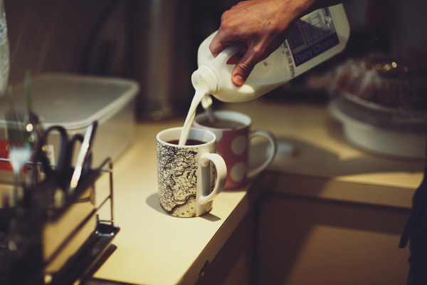
i did that a couple of weeks ago as well when i made chicken stir fry which was so so yummy. i think i need to cook more, because as i've proved a small amount of times, i can actually do it!
anyway, i think that's enough of my procrastinating for now. for the rest of today, i'll be retouching some promo band photos, some more wedding photos for a client, and hopefully i will have a wedding blog post up soon, i have some live photos to edit and post up to a bunch of places and a film to start working on! im working on a blog post on how shooting a wedding works, because its something that i'd like to share with you all. is there anything that you guys would be particularly interested in me writing about?
i woke up this morning and it is christmas eve and i really felt like creating something. this photo is from
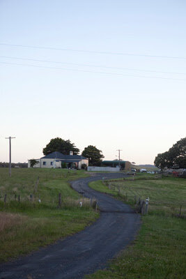
the long weekend a month ago i spent at my dad's house. one afternoon at sunset, we went driving
through the windy country roads, where there were cows walking next to the car, fields that went on
forever, broken trees and lonely homes.
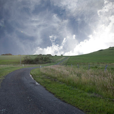
this is the original picture, i cropped it to a square then used a layer mask to completely get rid of the sky
and some of the mountain.
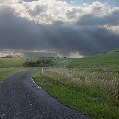
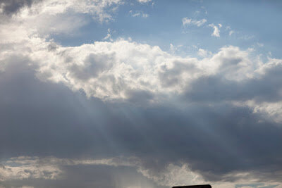
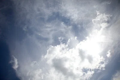
i added a picture of a more interesting sky from a completely different day, but it wasn't working so well.
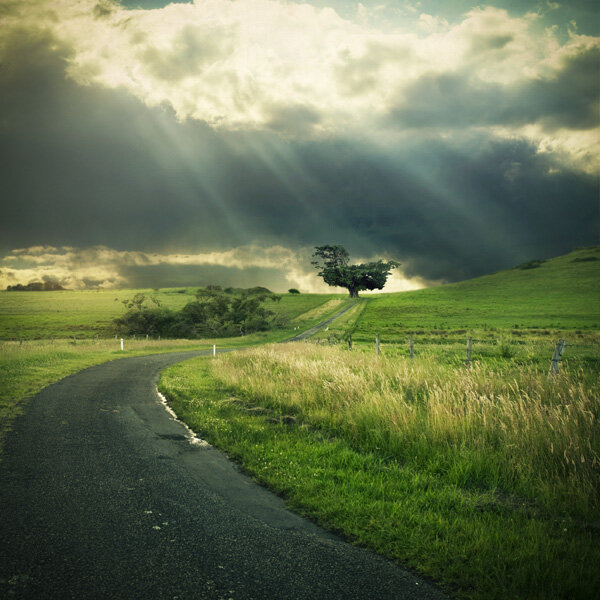
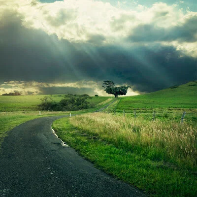
i tried a few more til i ended up with this:
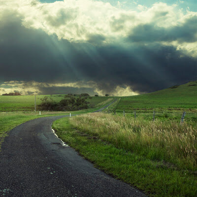
added more contast to the image with curves in photoshop, as well as editing the colours. i really wish
you could edit photoshop files in camera raw, but it doesn't let you.
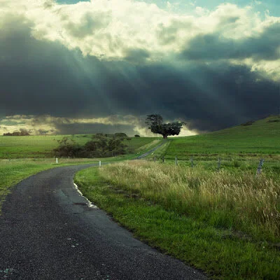
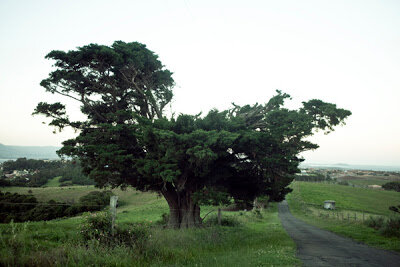
i then decided to add a tree at the end of the road so there is a main focus to the image. before the tree i
added a little house, but it was too boring and didn't flow with the immense amount of green in the rest
of the picture, so i got rid of it.
these are the original images i used:
hope you like! i have a few more field picture that im planning ideas for. hopefully i will have a series
of square images soon. for now though, i need to stop procrastinating and get back to sending
proofsheets and retouching!
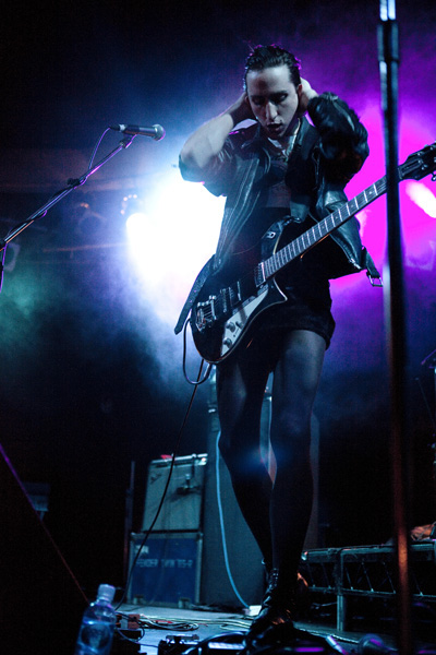
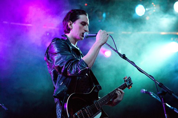
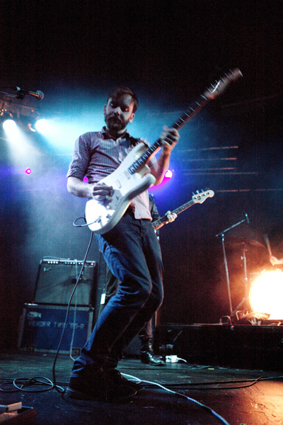
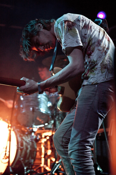
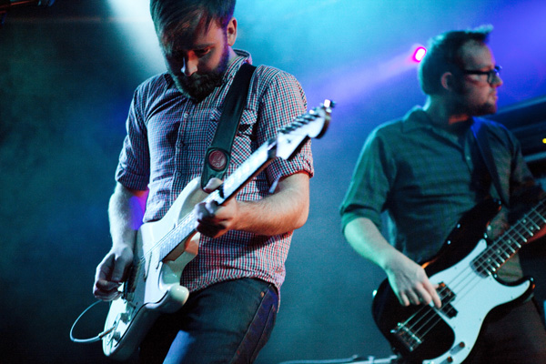
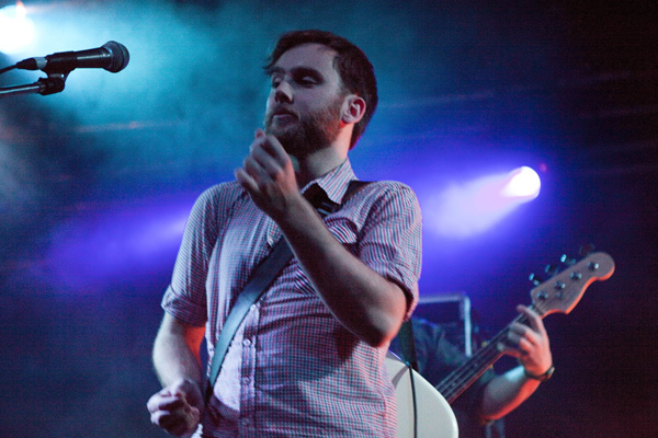
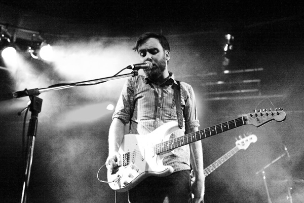
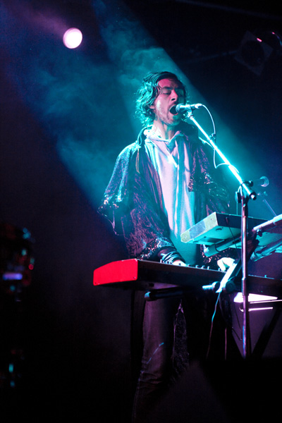
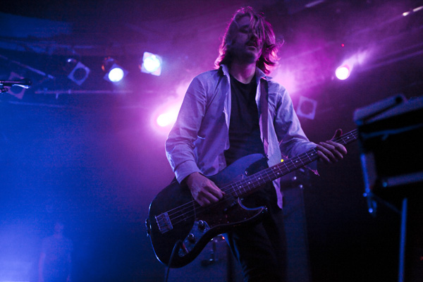
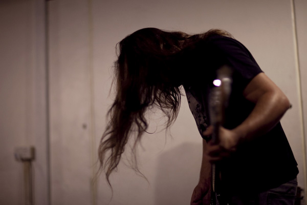
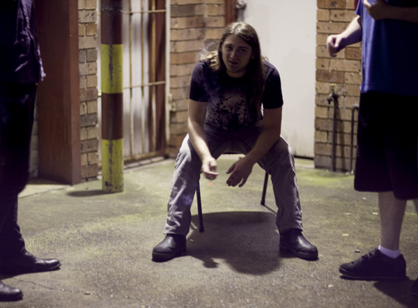
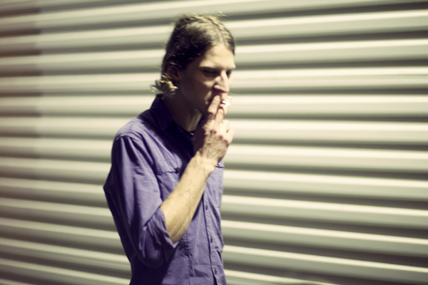
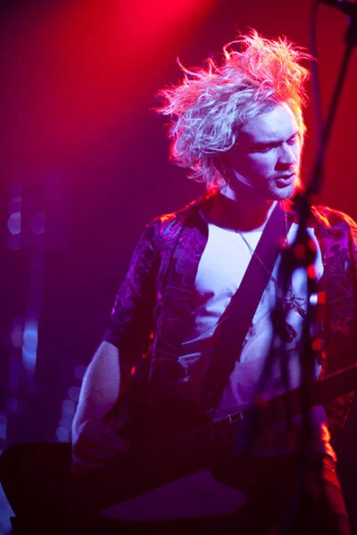
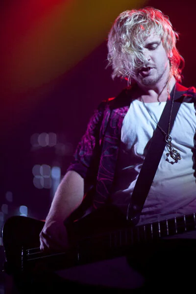
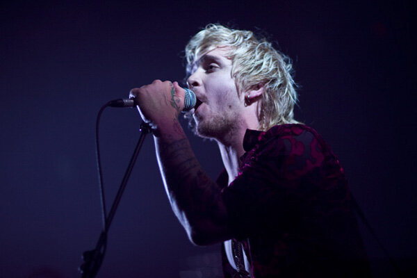
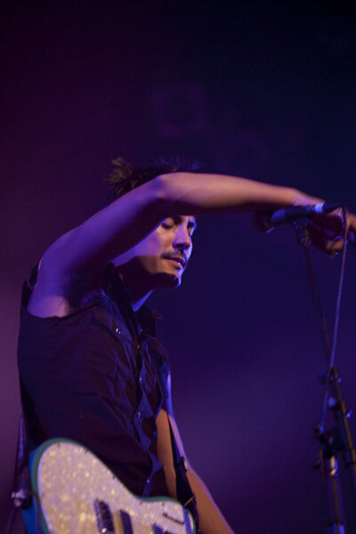
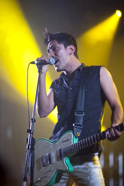
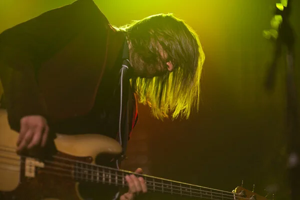
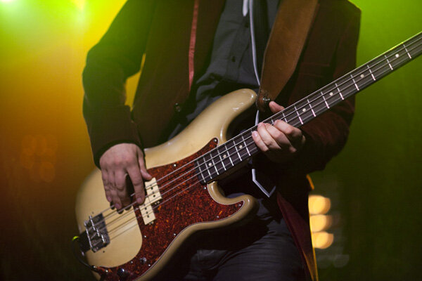
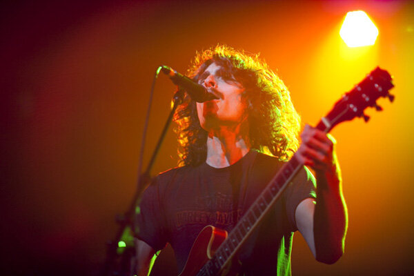
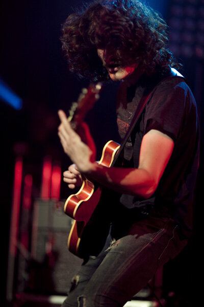
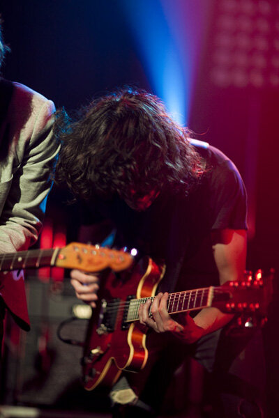
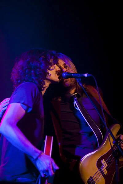
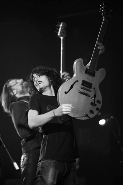
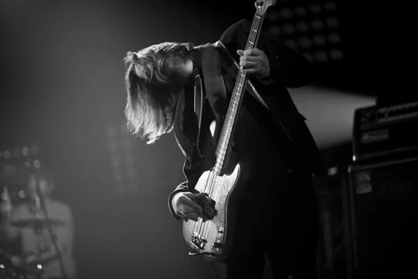
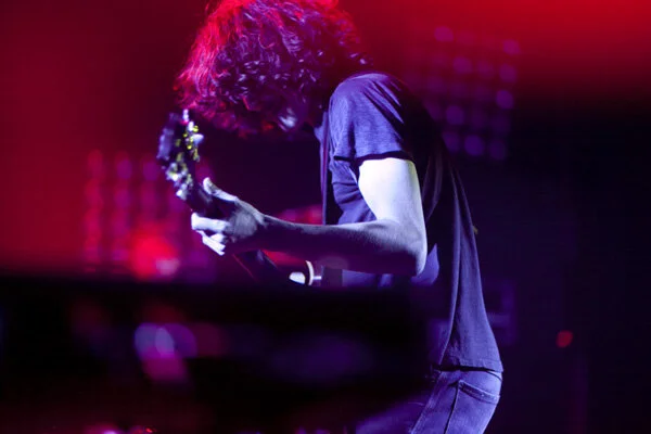
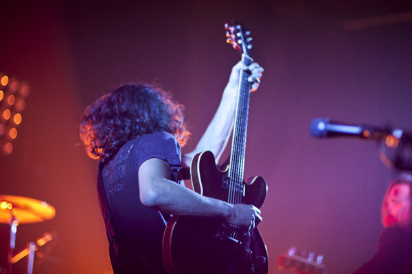
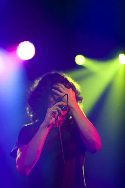
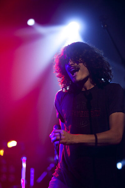
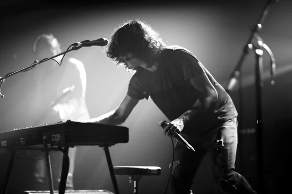
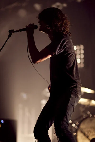
last friday night i shot thirsty merc at the metro. it was the first time i got an actual physical photographer's
pass woot! there were two support bands, lucy hall, who sounded a lot like florence and the machine
with a pretty voice and ukulele and the white bats, who are in the first five photos of this post. he rest of
the pictures are of thirsty merc! the photographer's pit for this show was amazingly spacious, there were
only about five of us taking pictures;
two of whom sat down, so there were really only three of us running back and forth. so, five people
compared to the about ten at the last show i shot, which was midnight juggernauts, really makes me happy haha.
this is the first of about a million and one blog posts to come this week!
i don't know what sparked it, but today i decided to go back and create some pictures in style of my older
work. this is what i got! here are the steps i took to create it:
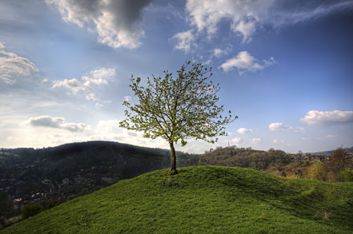
this is the original image, stock from sxc.hu
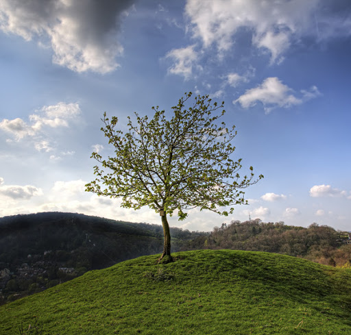
so first i cropped the photo. i kind of liked the little town on the right hand side of the image and clouds
on the left, so to not lose that in the cropping, i selected each side of the picture individually and
transformed it. then with layer masks i just painted the edges back so they would blend. it is subtle, but i
still think it makes a difference.
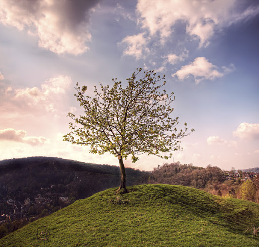
with curves i continued adjusting the colours of the image until i was happy. the sun looked pretty low in
the image, but everything still had middle of the day lighting, so i thought it would look more dramatic if
i added warmness.
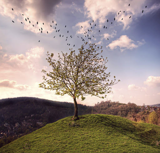
last but not least i added my famous birds (my own image), and moved the birds around so it looked like
they were sweeping into the tree. i did the left had side first, then copied the layer and flipped it. with
layer masks i got rid of a few birds here and there on either side as well so it wouldn't look too identical.


